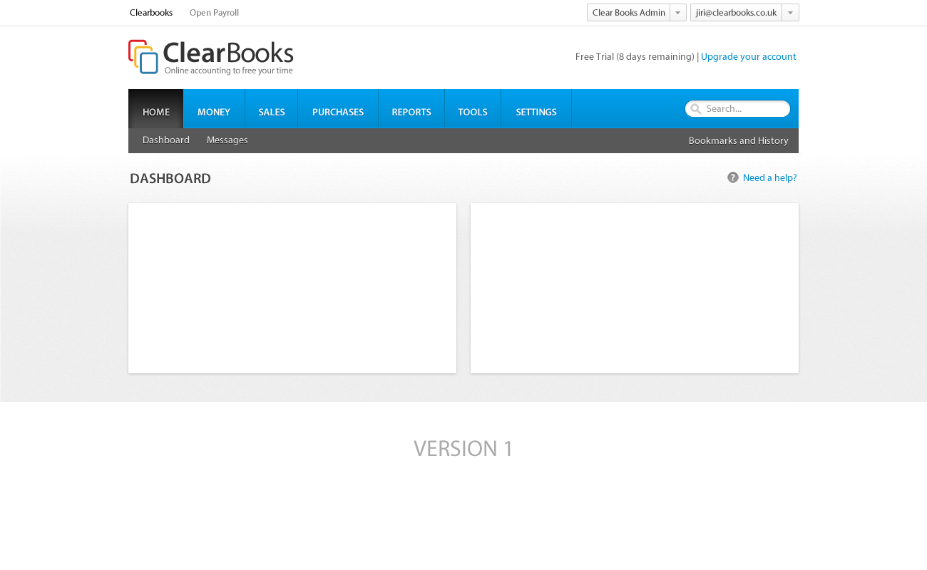
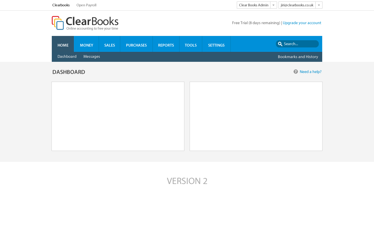
Following from the previous blog post about the new menu navigation bar, the team has come up with two designs and we would love to hear your thoughts about them!
These two designs focus on the main navigation bar only, particularly if you prefer a gradient or flat design, but if you want to give us your opinion on anything else, please do so!
Version: 1 (Gradient)
Version: 2 (Flat)
To see the full size images, just click on them and you will be redirected to Google Drive where you will see them!
Please make sure you also vote which is your favourite here!
@Adrain The difference between the two are quite sublte. The major difference is that version 1 has a gradient (i.e some lighting applied to it) whereas version 2 is a flat design. The other difference is that version 1 has a black background for the secondary navigation, whereas version 1 has a dark blue.