We are extremely happy to let you know that we have been working hard on our new theme for Clear Books. We have introduced new features which include:
Easily switch between our old and new experimental theme by using the link in the header.

No need to go to Labs and enable it any more. Clicking that link enables you to easily switch between the two, and get access to our hot up-and-coming theme.
Table re-styling and sticky headers
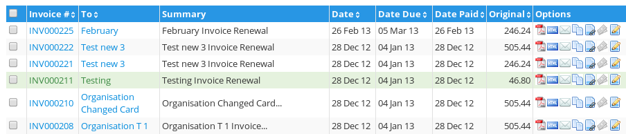
We have carefully re-styled tables in order to fit the new theme and make them more user friendly. In addition, we are now consistent when using tables to help improve readability.
Having troubles focusing on what row you are? No problem! Our zebra colouring and row highlighting take care of that. Have long tables? That’s no problem either! The new sticky header will now take care of that too! The header of your long table will now ‘stick’ so even if you scroll, you will always be able to see the header and easily know what column you are on!
Content restyling
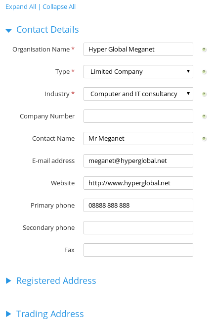
Most elements have now been restyled to fit the new theme. In addition, for better user experience, only sections that are required are now shown to you. Dont worry though, you can easily display the rest by either clicking on their title, or using the ‘expand all’ option on the top of the section.
New Footer
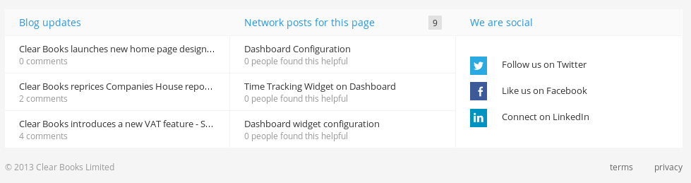
The new theme also introduced a new footer. This footer provides easy access to the latest blog and network posts, as well as handy links to get social with Clear Books!
Don’t forget, you can try all these new features by either clicking on the ‘Try our new experimental look’ in your menu, or by enabling it in Labs!
We can’t wait to hear what you think about these improvements so do get in touch!
Thanks for the feedback Simon!
Indeed, it will. It is in our roadmap and will be rolled out to Open Payroll as well.
Appreciate your feedback Andy,
We work hard on the new theme make it as clean and user friendly as possible!
As noted below, we do have in our plans to roll out this theme to Open Payroll as well!
Thanks for your input Jodiwe,
We will take that into consideration, re-visit the footer and see what we can come up with.
tables with data in (invoices etc) look crappy, all the data in the columns wrap.
Would be nice if your design could be adaptive to support larger screens.
Nothing has changed in regards with how data wrapping occurs. If the data is too big for a cell, it will naturally wrap due to having a fixed width.
We are working towards more flexible tables however, that will shrink or expand depending on the resolution of the screen.
I’ve been using this new design for a while and getting used to it.
Please can you put a fixed width on the date columns when viewing invoices etc, they are wrapping to two lines and it’s hard to read when viewing many items.
The sales link in the top menu now goes to /accounting/sales/list-all/ where previusly it took me straight to the unpaid list.
I’ve never used the list all page before so would be nice to have more control over what these links do, some options to define where the top links go by default?
Also would be nice if we could hide all that social crap in the footer, I don’t need that on every page thanks.
Thanks for your feedback James. We’ll consider your points above and act accordingly.
Hello Mohamed,
Thanks for the feedback.
While we work to deliver new features, we also try to improve our current ones by providing a more user friendly experience.
This not only makes it ‘look better’, but it also helps you perform your required tasks much quicker. It’s not all about the looks..