Corresponding with the recent introduction of RTI filing by HMRC, Clear Books has launched a new face to the Open Payroll home page inspired by the new Clear Books design.
With this launch comes a prime opportunity to create a new and exciting brand for our payroll product.
I am pleased to present to you the first stage of the Open Payroll design.
Below I will be taking you through the development process the design team used to reach the visual direction for Open Payroll.
WANTED: Open Payroll voice
First is finding our voice and how we want to approach you, the audience, through the use of text, colour and image.

It is important that the style and voice of Open Payroll compliment the Clear Books brand. As we launch more of our products, we need them to quickly be identified as part of the same family.
Clear Books strives to be fun, contemporary and friendly, and this needs to be reflected in how we present Open Payroll and ourselves. This influences our decision as to what visual direction we would like to approach. Using the new Clear Books page as a foundation, we will be working on this brand with some of the corporate fonts and assets.

Inspired by the flat design (a style which is crisp, 2 dimensional, minimalist and does not use real life textures to bring digital shapes and objects to life on screen) direction we are using for the Clear Books brand, we are taking this idea a step further into styling our illustrations. The vibrant colours, along with overlapping layers, all go into creating a simple yet fun visual style.
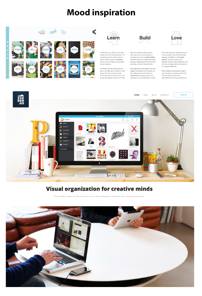
We’ve spotted some really impressive work from the guys at Acoustable (That’s a photo of their speaker table!). We’re loving the clean and fresh style they have produced with their layout, imagery, photography direction and icon use, and this has really inspired us.
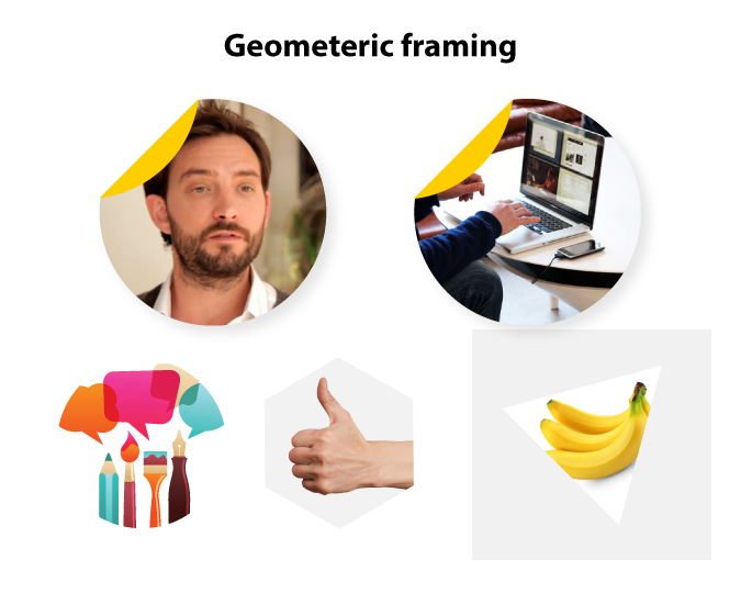
To make the style of the site more ownable for the brand, we’ve come up with the idea of using geometric shapes to frame our images with special little yellow corner details to complement the new Payroll blue. This small detail already lends itself pretty well to the brand, don’t you think :)? These framed images will be used as the top title images. Where we will use full image with text, a yellow panel with an angled cut will be used. This will easily reflect the corner idea without too much added fuss, keeping things clean and simple.
So we’ve laid out some ground work for the visuals and injected some placeholder content to make sure it’s super flexible. We can work with this on a variety of pages.
Oh ho, not bad!
To create movement during scrolling, we’ve introduced a light grey diagonal background. Additionally the dotted line can be used to lead the user’s eye around the page. This idea was inspired by the perforated lines you find on traditional payslips.
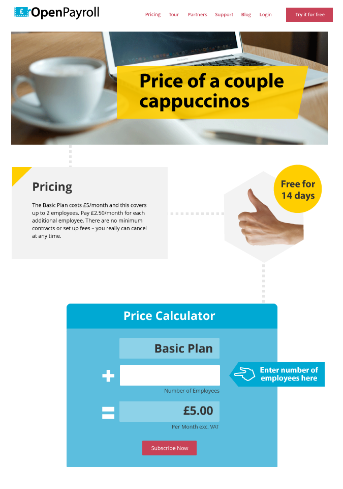
In the next step for designing for Open Payroll, we will be looking into the typography and spacing and fine tuning everything to become a real mean piece of design. The first page to be given treatment and released in this style will be the pricing page, which we feel is calling out for a handy price calculator, and so we’ve quickly mocked this up to give you an idea.
What do you think?
So that’s it for now.
I hope this post has given you some insight to how we’re designing here at Clear Books! As it is still a work in progress, if you do have any feedback, questions or suggestions- leave some comments. The design team will look at factoring them into our design process.
Thanks for reading.